STUDENTS PROJECTS
PROJECTS 2011

29 June, 2012
Metro station “KERAMIKOS”
Architectural intervention of the entrance of metro "KERAMIKOS" in Gazi.
Students : Panagiotopoulou Aikaterini, Schinas Spyridon
Supervisor : Anastasakis Manolis
T.E.I. of Athens - Department of Interior Architecture, Decoration and Design of Objects
Date : March 2011

The underground movement of the user of Metro varies from station to station. However, the entrance to a metro-station, although it will always have the same result, our transition to another part of town, could also differentiate with appropriate aesthetic interventions and become representative of the area in which it is located. Besides, each station's name implies a reference for the user- passenger to pictures and landscapes of the region.
GAZI
Gazi is an area of Athens which is located southwest of the intersection of Iera odos street and Piraeus street. This is an area that previously had a strong industrial character due to the operation of a gas plant for a long time. However, the closure of the factory in 1984 and its conversion in 1999 into a space for cultural activities, known as the "Technopolis", were the beginning of a new dynamic, even violent, development of the area soon became an attraction of the city of Athens. The operation of the metro-station "Kerameikos" was a milestone in the development of the region, since it multiplied the visitors and turned the area into a mass entertainment place with major gathering points surrounding the central Square and the sites along Iera odos Street. Of course, the new profile of the area contradicts the efforts of the state for cultural development as it introduces major differences between the standards of mass entertainment and the standards of living.
THE ENTRANCE TO THE METRO
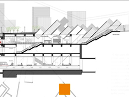
The entrance to the Metro belongs to two parts which may be perceived in a deep contrast or accordance. The reception of the user to the station or to the Square, depending on his direction, is achieved by creating an intermediate site, a transition point. The entrance to the metro as an area of transition could create a bipolar counterpoint of separation and unity. The increasing or decreasing natural light indicates the direction and generates during the day a pleasant and constantly alternating ephemeral. The external sounds and natural colors influence the psychology of the passenger and prepare him for his underground movement. Upon descent, the diffusion of light functions soothingly while indicating a direction to the user.
At the ticket issue/reception area of the metro station, the passenger can validate his ticket, contact with the competent employees or draw information from interactive surfaces. Furthermore, after the sunset, the passenger gets actively involved in aesthetic result of the intervention. The entrance from Dekeleon str. allows the passenger to maintain the eye contact with the platform level, familiarizing with the entire space.
The consolidation of the two separate entrances aims at their equal use of the two entrances and the underground crossing by the public of the square providing an optimal alternative for passenger/pedestrian traffic. Additionally, the visual integration of the east entrance at the square negates the underrated role of the existing entrance from the Dekeleon str.
THE INTERVENTION
The emergent intervention is an associative reference to the train wagons and symbolizes the passenger flow. By keeping the proportions of the subway cars - which metaphorically protrude from the surface of the square, mimicking passenger traffic - and by using translucent white concrete for the construction, which is perforated, we aimed to provide additional natural light inside, beyond the openings at the roof of the station. This also serves the functions of passenger flow through the stairways and elevators through natural lighting and ventilation.
The dominant vertical axis of a building meets the ground at a right angle. Such a building seems to be continued into the ground. This visual impression could be considered as a biological allusion to the emergence of plants from the soil. However, if we compare buildings with plants, a clear difference seems obvious: The plants are sprouting from the land; a tree trunk is not standing on some basis. The visible part of the tree looks like and is incomplete because the hidden root system, in the base, underneath the surface. A similar approach for a building should attempt its depiction as a visible form emerging from a hidden underground structure. Although usually this is not the intention, we particularly aimed in this case to give to our intervention a suspension of "incompleteness", as well as to emphasize on the physical and conceptual continuity of the superstructure and the underground structure. With the same aim to negate the sense of levels we reclined the superstructure 45o degrees, instead of using conventional right angles.
THE SQUARE
As far as the square is concerned, this intervention provides a pleasant visual effect, since the perforated nature of the work contrasts its volume. During the night the alternating light and the groups of seats create a significantly attractive place with a hospitable profile. The linear tiling includes the formulation of scattered planting, which is fully accessible. The lack of levels provides an open field. Lines of white concrete run through the square and towards the intervention, highlighting its shape. The bright surfaces between the two entries indicate the upward movement of the conceptual "subway cars" and lead to the lower edge of the square where said movement has not yet passed into the underground, from the glass surfaces on the roof of the entrance.


Related articles:
- Urban reconstruction using the train ( 11 March, 2011 )
- Central bus station in the area of Eleonas - Botanikos ( 26 April, 2011 )
- Gullesfjord Weight Control Station ( 23 October, 2012 )
- Suburban Railway Station. Urban regeneration in Rouf, Athens, Greece ( 21 January, 2013 )
- Interventions on the urban railway stations of the network Patras - Rio ( 13 February, 2013 )
- In.Bu.S, Intercity Bus Station in Chania, Crete ( 02 April, 2013 )
- Railway Station Complex in St. Denis district in Patras, Greece ( 11 April, 2013 )
- Souda Port Passenger Station, Souda Bay,Chania,Crete ( 10 June, 2013 )
- Railscapes: Tracing routes of rail history ( 17 March, 2014 )


