ARCHITECTURAL REVIEW
08 June, 2010
The Acropolis Museum: An Unhappy Fit
Let us take away a lesson from this missed opportunity. (by Jan Lepicovsky)
(Bernard Tschumi responds to this article.)
Last June, after three decades of competitions and debate, the Acropolis Museum in Athens opened to the public. It was designed by internationally re-known architect Bernard Tschumi, and it houses nearly 4000 ancient Greek artifacts, including the great stones of the Parthenonʼs frieze. I first visited the Acropolis 15 years ago as an undergraduate student of architecture. Last month I had the opportunity to visit the site again, now with the eyes of an experienced architect. Hearing about the controversy surrounding the new museum, I was eager to see how one of the great theorists and idols from my student years responded to such a challenging, high-profile commission.
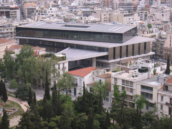
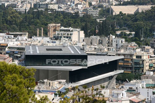
My first glimpses of the building brought that familiar rush of excitement and anticipation, the kind you get at a concert just before the performer takes the stage. The simple geometric volumes, one rotated above the other, were familiar from pictures and, seeing it live, I could appreciate its powerful yet restrained presence. I walked the long way around to the front in order to take in the whole exterior. By the time I had made it around the block to the entrance, my initial excitement had faded and a different impression began to form.
What I discovered was a building of that shows little regard for its surroundings in the adjacent Plaka neighborhood, the only surviving 19th century district in Athens. The site planning resembles a foreign embassy instead of a modern museum; that is, it designed for security instead of openness. Occupying three quarters of a large city block, there is only a single point of entry, and it requires descending a staircase past a gated checkpoint. One has only to view the project from the acropolis itself to see the relationship: an elevated megalith, completely fenced off from the surrounding 19th century urban fabric. Given the precious nature of its archeological content, the security needs are no doubt great. Yet those needs must be reconciled with the need to build an accessible and pedestrianfriendly urban space. Alternatively the museum could have been located at a more appropriate site, such as the renovated former beer brewery on Syngrou Avenue, where the new Museum of Contemporary Art is now being built. It is a fundamental question of the compatibility of site and program.
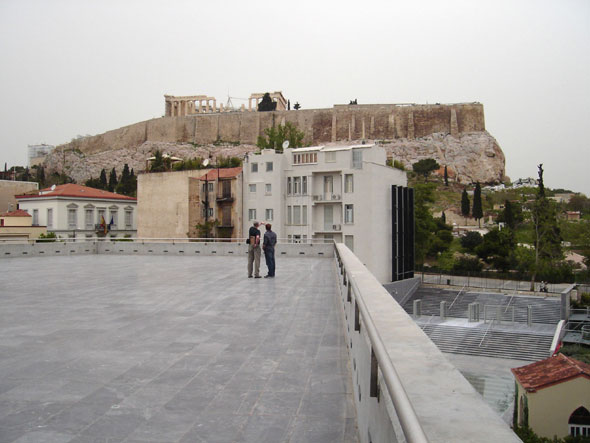
Entering the grounds, the visitor is greeted by a polished stone terrace topped by a steel canopy, gesturing like a tour-guide towards the acropolis. The problem with this gesture however, is that the visual axis it implies is partly disturbed by a view of the backside of two historical buildings, rare gems in this city. It appears that the museum was insensitively designed with the intention that both of these buildings would be demolished, in order that not just the Parthenon, but the entire base of the acropolis site is fully visible from the museumʼs front entry. At the time of this writing, these buildings are slated to be demolished, despite the public outcry. The Parthenon is visible from this point, so the only benefit to demolishing the buildings would be to provide an unfettered view of the acropolisʼ fortification walls as a background for tourist photos. A better and more ecological solution would be placing a grove of trees to block the view of the buildings, as has been proposed by a group of local architects and landscape architects. So far there is no response from the Ministry of Culture. It would be a great mistake that would rob the cityʼs inhabitants of two very fine historical structures.
The site design does not encourage exploration, save for the carefully delineated glassfloored catwalks where visitors can see remnants of the old cityʼs foundations. Instead of being designed for visitors to enjoy, the landscape areas are akin to putting greens - well-maintained, yet uninviting. Not to mention un-ecological.
Entering the building, one has again the impression of visiting an embassy. The blastproof concrete exterior opens to a surprisingly underwhelming reception lobby. A black stone floor, low plaster ceiling, and queuing files for tickets and security check evoke an upscale bus station. Having bought a ticket and entered, the first big hall finally offered something to enjoy - a multi-story gallery displaying beautiful sculptures, proceeding towards a grand staircase. Ascending the stair to the first floor one finds a spacious exhibit hall generously illuminated by skylights and diffused floor-to-ceiling glass. The impression is spoiled, however, by the massive and redundant columns, which make it difficult to appreciate the sculptures. The interior design throughout is museum standard without much attempt at creating a variety of spaces or user experiences.
Reaching the museumʼs pinnacle moment, the third floor gallery with the parthenon frieze, requires ascending past the cafe terrace and bookstore on the second floor. There is no architectural celebration of this movement here, two escalators flanking an unused staircase. We might as well be passing from Arrivals to Baggage Claim.
Fortunately the trip up was worth the effort, as the top gallery is quite enjoyable. From here one can view the great frieze assembled and partly reconstructed in full scale, while simultaneously seeing the parthenon itself from which it came. It is the only part of the museum that is really meaningful and successful. The cafe on the second floor feels much like the main lobby - low-ceilinged and deadpan, while the exterior terrace broils unshaded in the summer heat.
For all his writing about event-cities and the urban experience, Bernard Tschumi has disappointed here. A major museum has a civic responsibility beyond its function as a viewing place for artifacts. Here was an opportunity to provide a much needed neighborhood amenity at the intersection of the modern and historical city quarters. The scale of the new building could have been made welcome by a sensitively landscaped perimeter that invites visitors to enjoy its grounds, or it could have provided a public amenity such as a mini-park or outdoor theater. In my student days we celebrated aggressively modern buildings that were seemingly air-lifted into their historical contexts, like the Centre Pomidou in Paris. What I understand now is what really makes that project a success: it is not just the machine iconography; it is the generous public square and how the building opens onto it, offering the city a giant outdoor living room. The Acropolis Museum, on the other hand, offers very little to its neighborhood. Let us take away a lesson from this missed opportunity.
Jan Lepicovsky
Project Architect
We are grateful to Jan Lepicovsky for permission to publish his text in greekarchitects.gr (English and Greek)
Bernard Tschumi, architect of the new Acropolis Museum in Athens, responds to "The Acropolis Museum; An Unhappy Fit" by Jan Lepicovsky and you can read his response here.
More:
Vortexes, puzzles and vertigo - 2008-01-16. Fate had in store for civilization a childish literal interpretation of the Parthenon, by means of a glass box cage on the third floor of a new Museum by the foothills of the Acropolis of Athens.
(by Anthony C. Antoniades, Architect-Planner, former Professor of Architecture UTA)
Related articles:
- DESTROY below the ACROPOLIS - VIDEO ( 13 November, 2007 )
- Architectural cannibalism in Athens ( 23 July, 2009 )
- The Acropolis Museum: An Unhappy Fit ( 08 June, 2010 )
- The New Acropolis Museum: A Triumph of Sophistry ( 21 September, 2009 )
- Αrchitectural competition ( 13 March, 2009 )
- D. Areopagitou 2008: reformation competition of the rear views of historic buildings towards the new Acropolis Museum ( 25 July, 2011 )
- New Acropolis museum ( 06 January, 2013 )
- New Acropolis Museum (NAM) ( 07 October, 2013 )


