ARCHITECTURAL REVIEW
21 September, 2009
The New Acropolis Museum: A Triumph of Sophistry
The Acropolis Museum fails its context on multiple levels, persisting with exhausted clichés like ‘visual connection’ and abstract conceptions to justify architectural decisions that let everyone and everything down once actually experienced. (by Dr Alexandra Stara) 
The original version of this article was published in The Architectural Review, no. 1348, June 2009
The new and improved Parthenon, the centrepiece of the Acropolis temple complex in the heart of Athens, was rebuilt in the heyday of the Athenian state in the 440s BC, following its earlier destruction by the Persians. It was only decades old when Plato was writing his philosophical dialogues, a couple of miles down the road. In the next two and a half millennia, both works went on to become influential beyond measure, lying at the foundations of western civilization. Architecture in particular is a discipline that has been shaped by Platonic thought and its legacy almost as profoundly as by the Parthenon and its various interpretations, appropriations and critiques. Unfortunately, one of Plato's later dialogues, The Sophist, does not appear to have made a specific impact on architecture. In this work, Plato warns against the art of sophistry as a way of reasoning and public speaking based on the fabrication of seemingly truthful, yet actually false arguments. Not always intended to deceive, sophistry was often a show of intellectual and verbal artistry and skill, but because of its self-reference it served no-one, except the person spinning it against the common sense of the polis. The new Acropolis museum in Athens, expected to open to the public later this year, is a testament to the enduring allure of sophistry and the failure of the polis to assign a task of such significance properly.
The project has had a long and troubled history of over three decades, with several competitions launched and cancelled along the way, and all manner of disputes and difficulties repeatedly throwing the scheme back to square one. Swiss architect Bernard Tschumi finally landed the job in 2000 and was expected to deliver the building in time for the 2004 Olympics, but further delays due to archaeological finds on site pushed the deadline back another five years. The site, at the foot of the Acropolis hill on the southeast, is further plagued by an extremely difficult shape, wedged between existing buildings of varying architectural merit. These include two conservation grade residences, which, as a bizarre afterthought, are currently under threat of demolition because they block the new museum's view. And as if this wasn't enough trauma for one project, the very programme of the Acropolis Museum is focused on an absence: the centrepiece of the collection is the group of Parthenon sculptures currently in the British Museum, which Lord Elgin brought to England in the first years of the nineteenth century and which the Greeks have been demanding back for several decades now.
The resounding significance of such a project, however, reduces these otherwise substantial issues to mere quibbles. What is at stake here, and, conversely, what is on offer for an architect to fruitfully draw from, is one of the richest situations an architectural scheme could find itself in, rubbing shoulders with archetypes. This is not only because of the ideas embodied in the Acropolis and their legacy - the intellectual, political and metaphysical implications of the place as the heart of classical Greece; but equally because of its reality as architecture - as topography, tectonics and type.
So how does one go on about designing what is effectively a surrogate Acropolis, at the foot of the original?
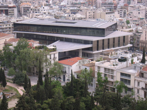
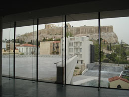
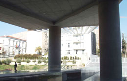
For Bernard Tschumi the answer was simple. Armed with his favourite design strategy - as he confessed during a presentation of the building in the RIBA late last year - the architect composed the building as a superimposition of three shifted geometric grids, pretty much as he did at his most famous project, the Parc de la Villette in Paris, several decades ago. The lower grid relates to the concrete columns that raise the structure off the ground and expose the archaeological site below, and the top grid is a glass box aligned with the Parthenon, opposite, corresponding to a main exhibition hall and café, and offering panoramic views of said monument. In between concrete columns and glass box is the central volume of the building (the middle grid), its geometry shifted from both the columns, below, and glass box, above; it is also largely glazed, featuring vertical fins in parts, for shading. A huge concrete and steel canopy juts out above the museum's entrance, intended as a marker from the main street, wherefrom the building is considerably recessed and partly concealed.
The rhetoric accompanying this scheme is lengthy and sonorous and comes as much from the architect as from his clients - the new museum's own 'Organization for the Construction Of'. Much is made, for example, of the 'conceptual clarity' of the project and how it reflects that of the ancient monuments. But the design concept is only apparent in the architect's diagrams and his explanations. The building itself - as inhabited, not represented - has hardly anything to do with it. As with la Villette, the abstract geometric constructs that have generated the project have little effect on the actual experience from the ground. The geometry of the Acropolis suggests a very precise understanding of architecture as experienced event, as movement and measure of temporal rhythms. Its drawings tell you little of its reality and meaning. With the Acropolis Museum it is almost exactly the opposite.
The reality of the Acropolis Museum is the relentless banality of its spaces, consistently poor material choices and frightful detailing. The whole ground floor, holding entrance lobby, temporary gallery and retail/ancillary spaces, as well as the main staircase hall and landing onto the first floor galleries, has been open to visitors for several months ahead of the official opening of the building on June 20, 09. This has been sufficient to show that none of the commendable aspirations of the design - clarity of concept, simplicity of forms and material, relationship to Acropolis and remains on site, etc - have actually made it through the translation from words to building, and thus remain pure rhetoric.
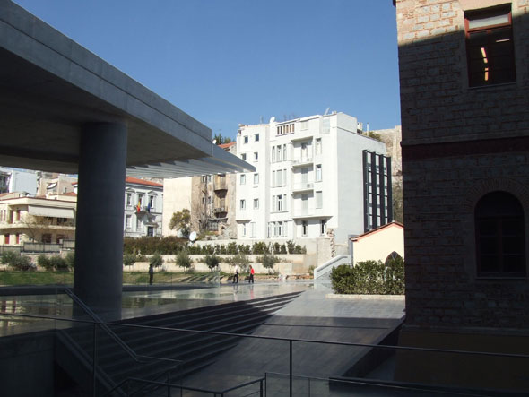
Greeted by the crass canopy, perfectly positioned as if to ram into the demolition-endangered residences and then onto the rock of the Acropolis itself, one crosses a patchwork flooring of glass and stone slabs (to allow views to the remains below, also visible through the large open hole under the canopy) in order to get to the building's entrance. There is nothing wrong in principle with 'subtle' and 'unimposing' as a design strategy for a museum lobby, but what happens here simply isn't it. What we have instead is a totally underwhelming space, not small yet strangely awkward and ungenerous, with clumsy layout and strikingly bad details, surfaces and fixtures. The effect is that of an entrance to a used car dealership rather than a museum.
The same effect continues throughout the ground floor, in the temporary exhibition space and other accompanying functions. The staircase hall, which is concealed from the entrance and opens to the left, past the ticket counter, is obviously designed to surprise with its contrast to the lobby. The double height space, with a clear orthogonal plan and no columns, is a grand corridor culminating in a staircase of the same width, which takes the visitor to the exhibitions halls upstairs.
The walls are clad in prefabricated concrete slabs with large round perforations, like oversized domino pieces, and the floor is entirely glazed (remember: ruins below), although, in parts, with opaque glass to relieve the vertigo-prone. The proportions of the space are more Egyptian than Greek, yet with the polka dotted walls and glazed flooring the whole thing resonates loudly with commercial references rather than anything to do with art (pace Koolhaas and Hadid, who know how to make their shops glamorous and who would have at least lit up those glass steps from below...). But this is more Lada than Prada, as a row of cheap turnstiles is how passage into this lofty hall from the lobby is controlled, reducing architecture to mere décor with no functional integrity and, alas, no decorum.
This holds equally on the level of detail, as the prefabricated concrete and glass slabs composing this room are fitted with evident sloppiness and are already chipped, flaking or sagging. Unless the galleries were built by a different team altogether and such things as their office-block glazing system will be miraculously substituted by something more suitable, it is very hard to imagine how the remainder of the museum might offer a different picture.
Lacking an understanding of prepon, the earlier Greek word for decorum, wherefrom 'proper' and 'appropriate' come, the Acropolis Museum fails its context on multiple levels, persisting with exhausted clichés like 'visual connection' and abstract conceptions to justify architectural decisions that let everyone and everything down once actually experienced. This being the case, the failure of the building as a tectonic structure is even more grating. Prefabrication and the mechanical sharpness of 'minimal' modernism (from Tschumi again) are much harder to pull off than the hand-made, in-situ approximations of craft; and this is nowhere more true than in Greece, where the standards of building construction are not, let's say, quite what they are in Switzerland. The great (and, tragically, late) Greek architect Kyriakos Krokos knew this very well, and his Byzantine Museum in Thessaloniki, like all his other projects, presented a version of the modern that also understood the tradition of making and the realities of building in his homeland, with incomparable results.
But Tschumi is Tschumi, with a considerable oeuvre, both written and built, that makes his position on architecture abundantly clear. The real question is what were the great and good of this glorious city hoping to achieve when they sat down with him (and long before him) to define and develop this project, and how can they still stand before us, before this very building, and rehash the same sophistry about light and clarity and you name it, as if they have never seen well-made architecture in their lives, as if this isn't all happening at the shadow of a certain Acropolis.
Dr Alexandra Stara
Principal Lecturer
Director Graduate History & Theory
Course Director MA Thinking Building
School of Architecture & Landscape
Related articles:
- DESTROY below the ACROPOLIS - VIDEO ( 13 November, 2007 )
- Architectural cannibalism in Athens ( 23 July, 2009 )
- The Acropolis Museum: An Unhappy Fit ( 08 June, 2010 )
- The New Acropolis Museum: A Triumph of Sophistry ( 21 September, 2009 )
- Αrchitectural competition ( 13 March, 2009 )
- D. Areopagitou 2008: reformation competition of the rear views of historic buildings towards the new Acropolis Museum ( 25 July, 2011 )
- New Acropolis museum ( 06 January, 2013 )
- New Acropolis Museum (NAM) ( 07 October, 2013 )


