ARCHITECTURAL PROJECTS
TEMPORARY

22 August, 2010
Shanghai Expo Pavillions 3
More than 190 countries and more than 50 international organizations participate in the Shanghai World Expo, the largest ever. (C Part)
French Pavilion - The sensual city
Architects: Jacques Ferrier architects
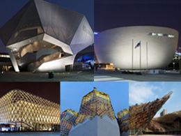
Drawing on classic French style, Jacques Ferrier Architectures designed the gorgeous French Pavilion for the Shanghai World Expo, which welcomes visitors inside a green-walled "Sensual City". The pavilion, which looks like a wire cage, is intended to resemble a white floating palace. Design of the pavilion embodies the kinetic effect and the concept of balance, with which a large amount of video projections, moving images, irregular outline borders, and reflected jumping waves are provided as background to make a living structure.
The France Pavilion is unique in terms of both form and technologies. It will present France's contribution in the sustainable urban development for one of the biggest economic metropolises on the planet. The French government has allocated a record 50 million Euros budget for the national pavilion, probably the highest among all participants.

Structure-Materials
The pavilion's lattice-like exterior shade is constructed from a new type concrete material, surrounded by water, and gives the sense that it is floating. Inside is a main courtyard with growing walls that lead to the green rooftop along with ponds and water fountains. Gardens are the centerpiece of the pavilion. Plants, bushes, and flowers cover the courtyard, roof and even the interior walls of the courtyard, while pools and water fountains help to cool the air. The 6000 square meter pavilion uses advanced building materials and environmental protection technology including solar panels on top of the roof. Although, not a particularly green pavilion in terms of eco design, the use of the interior gardens, living walls and water features is inspiring and beautiful.


The experience
The Sensual City has been impressing visitors with a simple look in the facade and an exotic roof garden inside. With an exterior perspective, the pavilion appears to be floating in the graceful rhyme with water. Entering the palace, visitors can soak up the glamour of France and enjoy the fragrance of flowers amid the aquatic environment. Surrounded by the atmosphere that is permeated with French ambience, visitors may well think they are truly in the nation of art and romance. Another stunning feature of the pavilion that caught the eyes of the visitor is the romantic French-style roof garden where you can sit beside a pool of countless red roses. The Sensual City allows France an opportunity to reinforce its graceful image in the world's most populous nation.

Info: http://www.architravel.com/architravel/building/690
German Pavilion- Balancity
Architects: Schmidhuber + Kaindl
The German Pavilion has been christened "balancity" - a newly coined word signifying a city in balance. The 6,000-square-meter structure will be Germany's largest at any expo. It will showcase German urban life and how the country's design and products can help solve urbanization problems.
Visitors to balancity will embark on a journey through a city of ideas, moving around as they would in a real city - on foot, moving walkways and escalators - through thematic areas representing different urban spaces.
A city can be a good place to live - if it provides a balance between renewal and preservation, innovation and tradition, urbanity and nature, community and individual development and work and leisure. That's the message of the German Pavilion.
The architecture is very much like a dynamic, urban organism and than being conceived as a building, the pavilion is meant to be a three-dimensional walk-through sculpture with no defined interior or exterior.

Structure
Four large exhibition structures symbolize the interplay between the forces involved when loads are carried and applied, leant and supported. Seen in isolation, each exhibition structure is out of balance. It is only when they interact that a stable balance is created, reflecting the idea of balancity in its architecture. The exhibition structures form a large roof above the landscape that will offer visitors shade and protection from the rain. The result is a fascinating alternation between interior and exterior spaces, light and shade, constructed and natural elements, city and countryside. From this green, terraced landscape, visitors will embark on their journey through the urban spaces of "balancity". The highlight of the pavilion is a cone-shaped structure housing a revolving metal sphere, three meters in diameter and covered with LEDs, which will be activated by the noise and movement of spectators.


The experience
The visitors' journey through balancity begins at the terraced landscape on the ground level. Like a labyrinth, the path winds its way towards the entrance to the pavilion, as a variety of spatial situations emerge, a tunnel, squares and courtyards. It then ends on a terrace on the first floor, opening up a view onto the landscape and the pavilion's urban square. Via a tunnel, the visitor enters balancity's staged urban experiential environments. The journey through the exhibition structures is set up like a promenade. The visitors move along pathways, at times on moving walkways, as they are led through the various urban spaces. Double stores merge with single stores, and the slopes and turns in the different spaces moderate the visitor flow. At the end of the path, the visitor reaches a twelve - meter high, vertical amphitheatre-like room - the Energy Source. Following the show in the Energy Source, the visitor is gradually led downwards in a spiral consisting of three staircases, where he finally reaches the pavilion's event area.
Info: http://www.architravel.com/architravel/building/693
Finnish Pavilion- Kirnu
Architects: JKMM architects
"Kirnu" ('giant's kettle) is JKMM architects winning design for the Finnish pavilion at the shanghai world expo 2010. Head designer of the project is architect Teemu Kurkela. The overall vision for the pavilion was to portray Finland in a microcosm, as a miniature city, with the interior of the pavilion tells stories of Finland and its people. Like Finnish society, the pavilion combines creativity, high technology, and culture.
The architecture of Kirnu received its inspiration from nature. The concept of the pavilion is that of an island. Its form language is free without symmetry, as is a stone's. The pavilion, surrounded by a mirror of water, emerges like an island from the surface of the water and its surface is covered with shingles resembling fish scales. As does nature itself, the pavilion offers a quiet refuge from busy city life for anyone who wishes to enter.
The pavilion's main purpose is to present a vision of "Good Life." The six pillars of good life are freedom, creativity, innovation, community spirit, health, and nature. These pillars are integrated into the pavilion's architecture; in its spatial and functional solutions. The sculptural shape represents the freedom and creativity in construction enabled by technology. Innovation has been introduced into the project in the form of clarity but also in technical details. The pavilion winds around the forum, making the coming-together of people and community spirit part of the building's basic design. The natural elements of water and sky are an abstract element of the architecture. A comfortable and inspiring miniature city, the pavilion also provides an example of a healthy environment. People, nature, and technology come together here. The pavilion offers a forum for discussions about development policies for a better life.

The experience
The pavilion floats over the water, white and ethereal. A thin film of water cools the air flow around the pavilion. As one approaches the building, the subtle, scaly surface structure begins to take shape. The visitor walks on a smooth bridge towards the main entrance, whose fabric surfaces form an inviting portal to the pavilion. Visitors next arrive at the forum, Kirnu. Sheer walls made of fabric rise towards the sky. The wooden floor under the feet resembles a dock and smells of tar. A gently sloping ramp ascends within the thick walls of Kirnu toward the exhibition hall, a high space that winds around the atrium. After the exhibition hall, the ramp continues downward to the exit, shop, and restaurant area.

Sustainable Development
The pavilion is a laboratory for sustainable building, presenting Finnish solutions for future urban construction and keeping to the principles of sustainable development. After the expo, the building will be sold and put to a new use. The pavilion will be dismantled, then reassembled in a new location. It is also possible to add new stories to the building if its future function so requires.
Energy consumption will be minimized. The heat stress caused by the sun is reduced by the direction in which facilities face, the use of light surfaces, and the structure of the windows. Natural ventilation is used, to reduce the need for mechanical ventilation. The thick atrium wall forms a natural flue, and the building materials and construction methods have been selected with the aim of minimizing CO2 emissions. The most visible example is the building's facade, which is surfaced in scale-like shingles. These scales are made of a mixture of paper and plastic, which is a recycled product of industry.


Info: http://www.architravel.com/architravel/building/696
Russian pavilion- Children's paradise
Architects: P.A.P. ER architectural team
Following the conception of Nosov, the Russian pavilion has been designed by P.A.P. ER architectural team as a city from a fairy tale, thus, giving people the impression of a children's paradise. The Russian pavilion has managed to combine children's vision and high technologies and this is certainly a success.
An idea of three-parts became the foundation of the Russian pavilion composition solution. The pavilion consists of three main elements: 12 white-gold irregularly shaped towers, the cube "hovering in the clouds" lying on the foundations of all twelve towers and the internal installation.

The pavilion towers are going up symbolizing rapidly growing megapolises with skyscrapers of nonlinear architecture. The colors of the 20-meter towers are in white, red and gold, representing pureness, beauty, and wealth respectively. Each tower has its own carved patterns which symbolizing the different ethnic groups in Russia. The pavilion plan is similar to Slavic settlements, it symbolizes "the flower of life" or the sun, roots of "the world tree" (a spreading oak among the Slavs) where "the life heavens" lie. The towers "roots" are oriented to the center of the composition and support "the civilization cube" connected with a symbol "man".
The elements of the cube external decoration can move and that organizes huge surfaces of "the living facade" which by reflecting the sky, the towers, greenery and people will create an image of a giant living being at daytime. At night with the help of special lighting even more stunning effect of the changing light-color-dynamic screen is created.
The towers are functioned as restaurants, showrooms, offices, VIP lounges, and gift stores, while the central building functioned as the pavilion's main exhibition area.


The experience
The main exhibition area of the Russian pavilion consists of three parts: 'city for children', 'city for youth' and 'big world', each carrying themes of 'city of flowers', 'city of sun' and 'city of moon' respectively. The interior design of the City for Children is inspired by the famous Russian children's books "The Adventures of Dunno and His Friends" . Before starting their journey, visitors are advised to envision themselves as DUNNO and his friends when traveling through the building. Visitors may see giant fruits, flowers, and plants, dragonfly-shaped windmills, fruit-shaped houses, water pipes made of reeds, as well as cars running on solar batteries while they travel along the path. The City for Youth on the 2nd floor features a miniature artificial space displaying Russian youth's technological achievements as well as inventions of Russia's largest state corporations and companies. The Big World on the 3rd floor features many electronic touch screens showing the histories of mankind's' aerospace explorations, also the future perspectives of living in outer space. Through the exhibition of fairytale-like world and high technology, visitors' childhood memories will be aroused.
The pavilion architectural concept, scenography and the exposition plan will create special conditions for visitors which will let: touch the understanding of greatness of the Russian nation and its people, feel a great potential and determination for the future in the center of which there are interests of the mankind.


Info: http://www.architravel.com/architravel/building/694
Spain pavilion - the basket
Architects: EMBT
The Spain Pavilion is designed to be a hand-weaved wicker basket structure supported by the steel framework inside. As Benedetta Tagliabue, the designer of the pavilion, said : it is our ambition for our pavilion to reflect Spain's weather. To recreate a fantastic craftwork, in order to reinvent a new construction technique". "The Basket," as some have dubbed the pavilion, is composed by large patios, in the form of wicker baskets. One is open to the outside, attracting visitors and drawing them in. There have been used more than 8,000 wicker panels in brown, beige, and black. Wicker weaving is a tradition in both Spain and China and the pavilion is like a bridge connecting the two nations. The panels were handmade by craftsmen in Shandong Province, each one unique in design.


The exhibition takes place both inside and outside these basket-plazas. The Pavilion is therefore not a containing box which houses one space, but a series of nearly hybrid spaces which create an easy and fluent transit. It contains three exhibition halls which will take visitors through the time and space of the development of the cities in Spain with the theme of "From the City of Our Parents to the City of Our Children." The three displays are created by famous Spanish film makers from three decades.

Structure - Materials
Spain Pavilion has a steel structure and a wicker cover. The wicker is covered by a special material that is water-proof and which also keeps the pavilion at a comfortable temperature. Essentially the plan was realized with panels of woven willow stems hung as a skin from the bones of steel supports. As a result,the structure of the pavilion is a combination of the easy to build, solid and highly controlled steel structure and the hugely flexible wicker panels which allows the complex geometry of the drawings to be realized. The colours of the wicker -from the red brown to white - have been achieved by the treatments it naturally went though: stripping, maintaining the skin, or treating it to make it more durable. Pavilion is conceived as a series of baskets, some open at the top and some enclosed, creating a dappled light in courtyards, circulation and multipurpose spaces. The designers have also considered the possibility of bad weather during the Expo period such as typhoons or the summer Plum Rain season.

Info: http://www.architravel.com/architravel/building/692
Maria Anagnostou, Anna Loukidou, Eva Aetopoulou (ArchiTeam)
Alexios Vandoros (advisor)
Related articles:
- Norway-Powered by Nature ( 26 September, 2011 )
- Shanghai Expo Pavillions ( 04 October, 2010 )
- Shanghai Expo Pavillions 2 ( 11 August, 2010 )


